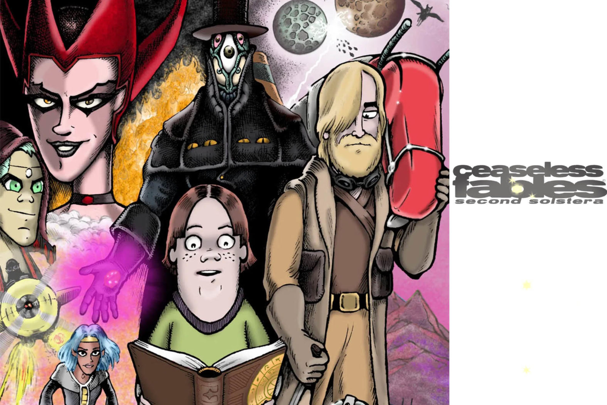
This page hopefully doesn’t look it, but from a couple standpoints it was a great big pain in the backside. Once I explain it a little better you’ll see what I’m grumbling about, and I’ll have exposed flaws in my work you never would have noticed before, not to mention completely sabotaging my own comic strip. So let’s carry on, shall we?
This page is actually part of an arc pre-written months ago, but here’s what a page requires after that; sectioning the dialogue into panels by number (based on the necessary timing of the “speech”), loosely graphing out the parameters of the panels (based around the shapes of the number of the page), roughing out the page in the sketchbook (including sketching any new characters needed), blue-lining the borders on Bristol board, placing the dialogue on the page (again, based around the shapes of the page number) in blue mechanical pencil (then using a Micron 05 to ink all text), using an 08 Micron to ink the borderlines and speech balloon borders, sketching the art composed as it is in the sketchbook, using the Micron to ink the speech balloon tails (closing all the borders), inking the art in Speedball India with a 102 crow quill nib and a Deleter G-2 pen, then scanning the finished page into Photoshop and coloring it digitally.
Are you snoring yet? Regardless of how boring the process might seem, I assure you this is how I operate at (nearly) peak efficiency. I backlog scripts until the time comes to use them and build up from there. Being efficient is key, because a lot of work goes into this long-running comic strip for which I don’t receive payment and almost nobody reads.
See, any time I miss a Sunday, it weakens the overall integrity of the comic strip. If I was working for an editor, which is typically the case with syndication, the best-case scenario would be that editor running a re-run, and worst-case scenario, I’d get booted. Editors get an idea of how long something takes to create when they see it; they often have seen thousands of cartoons in their lives. I have a character flaw where I work best under extreme pressure, and oftentimes this has caused me to biff deadlines by minutes. Editors were a lot more forgiving of lateness when you had to physically hand-deliver your work to the Bay Street newspaper office across town via Habersham on a bike. I made that trek so many times my nuts were ground into paste by a cheap bike seat and I became impotent. Guys; if you’re gonna ride a stupid bike, spend the money on a proper seat that makes room for your perineal raphe and doesn’t parboil your nutsac. Also one time I misjudged the height of a curb on the way to deliver a cartoon to the Creative Loafing office on Victory Drive and went over the handlebars, as karmic punishment for riding my bike on the sidewalk. But it was Savannah, Georgia, where more than once I was almost given the end-of-Easy-Rider treatment by truck-wielding maniacs angered by my legal use of the road instead of the sidewalk. So fuck ’em.
My point in all this is, producing one weekly comic strip is a lot more work than it looks like, but because the average person has, from a very young age, seen comic strips that appear six days a week, there exists this myth that being a cartoonist is something one can do in their spare time.
Well, sure you can. But you’ll be a shitty cartoonist.
Let’s compare two enormously successful comic strips; Dilbert by Scott Adams, and Calvin and Hobbes by Bill Watterson. Think for a moment about the two of them. Did you have an emotional reaction to one, or both? Look at a few examples closely. Can you tell which one is the work of a career cartoonist, and which one was based on doodles done by someone in a completely non-artistic profession, when they were bored? Cathy is similar to Dilbert in that its genesis was doodled in secret at some soul-killing cubicle job. Cathy’s Guisewite’s penmanship and passed-note ballpoint aesthetics couldn’t be more feminine if they came out of a locking diary with glittery hearts all over it.
Now the thing is, a successful comic strip doesn’t necessarily mean a good comic strip. Calvin and Hobbes was a rare bird, being both beautiful and consistently clever, with kinetically illustrated visual gags. Dilbert, despite its font-worthy lettering, is reductive to the point of banality in its art; characters and locations are rigid icons that exist only deliver dialogue from invisible mouths. Funky Winkerbean was another strip that had easy-on-the-eyes lettering and a more breezy style. I swear I saw a Funky comic once where it was just dialogue and photocopies of the house with the treble clef on the garage door. That’s the kind of thing you do when the clock is ticking (or the golf course beckons) and you’ve waited until the last minute. Though in reality, strips like Funky were produced months ahead of time (as per syndicate protocol), so it’s more likely that the strip I’ve described was filler to round out a slow week, or delay the consequences of a previously established plot device, or conclusion of an arc.
Back to my dubious point. Dilbert, Cathy, and Funky Winkerbean have simplified art for two reasons; one, because the artist knows their way around a pen and doodled often in their life, and two, because it sure as hell takes less time to draw. Bill Watterson approached Calvin and Hobbes from a more artistic perspective, like a cartoonist from the shirtsleeves-and-inkwell days. Even one of his strips without a standard joke or punchline is unique and lovely enough to beautify an afternoon for a while. Dilbert strips are practically interchangeable; Character A delivers setup to Character B, Character B reacts, then Character C appears to add the “twist” after Character A drops the punch (or before). Rinse and repeat. The lore is even more minimal than a kid with a stuffed tiger; a guy works in an office with some office workers (and talking animals) under an amoral boss with pointy hair. There are more visually imaginative comic strips in high school newspapers.
Here’s the difference between Dilbert and Peanuts. I mean, the one that’s not so obvious. Charles Schulz’s line looks “alive” because he used traditional cartooning materials, and almost literally every single image you see of Charlie Brown and Snoopy, he drew. That means his speed of output was the result of drawing the characters zillions of times and getting insanely good in the process. Yet if you break down how Schulz designed the characters and his distinctive (and oft-imitated) aesthetic, you can see the pen marks that make up the profile of the head; the lines are irregular and organic. Hair is scribbly and wispy. The look is simple, but you can still tell that a lot of love went into it, that someone is doing their absolute best. Not to mention, Schulz’s lettering and spelling were flawless, and his writing was on such a level of genius and relatable humanity, most Peanuts strips hold up over a half-century later. Millions of office workers have tacked Peanuts strips to their bulletin boards; millions of moms have taped Schulz’s work to refrigerator doors.
Scott Adams’ Dilbert is relatable to a specific breed of office drone, in particular the IT niche. Since it doesn’t appeal in any way to children, there exists no need to put any “love” into it, so there’s no reason not to make an easy-to-use font out of your handwriting, and you can save time by typing big ugly blocks of text into your speech balloons, because what good is practicing handwriting anyway, right folks? The visual aspect is what Joe Matt called “rubber-stamp art”, where the characters may as well be stamped onto the page. Joe Matt is another guy whose work you can look upon and see that he fiercely carved out his own style, using the established tools of the trade. His lines are “living”; even when he has “talking heads” scenes (no action other than dialogue exchange between two or more characters), he tries to avoid re-using the same shot, unless it’s for a specific narrative reason (conveying a “pregnant pause”, etc.). Every panel is an opportunity to introduce more detail and ideas, not to mention background and perspective. This is why, unless he’s lying in his books, Joe Matt is not a very speedy cartoonist. He tends to really put a lot of effort into his own stuff. Hence, it really “pops” when you read it. You can tell he understands the balance of positive and negative space.
I would bet cash money that Scott Adams doesn’t even have to hold a pen anymore. He most likely has a program that designs the strip from his typed (or spoken) specifications. He capped his artistic development with Dilbert, so there’s no point in drawing it because there’s no reason to improve; in fact it would even hamper the strip’s style if the art improved. He’s pissed off because using his strip as a political soapbox caused the expected booting and canceling. He was kicked off Twitter because he did a strip (fairly) criticizing the ESG, which is something TPTB don’t want you knowing about until it’s too late to do anything about it. Recently his cancellation has gone full-blown, after Adams made a comment that either I read wrong or was about the most racist thing one could possibly utter.
Many of you are probably familiar with Walt Kelly’s classic funny-animal strip Pogo. If not, it was a beloved strip fantastically illustrated by (I believe) an ex-Disney employee whose skills had surpassed those of his master. Despite its whimsical atmosphere and cast, Pogo was almost overtly political, albeit from a more generalized, humanist perspective. Because of the swamp environment, it was easy for Kelly to introduce ecological themes. Despite these qualities, only on rare occasions has he been criticized for “being too political”.
The key difference is the aesthetic. It doesn’t matter what Pogo is about or if it’s political; the art will appeal to young children who will carry that affection into adulthood. They will see a Pogo paperback in an antique store as a grownup and have to stop and consider purchasing it. (Books bring up a whole other benefit; the aroma of newsprint and/or Silly Putty has tremendous olfactory advantage over a computer screen.)
Newsprint smell probably reminds a lot of folks of collecting Calvin and Hobbes strips carefully cut from the morning paper, and for those who grew up on his most famous creation, he’s creating something new for them as adults.
Dilbert appeals to middle-aged intellectuals who hate their boring but cushy jobs, have no children nor a sense of humor, and will most likely die within the next two decades. The strip has all the passion of a dropped microwave taquito. And Scott Adams thinks he should be extra respected and heard because he became a millionaire in the funny papers, when it’s like bro, you literally did the least amount of effort from day one to become rich. You found a formula and made some real scratch back in the day. Just fade back, or keep doing the strip out of reticence. It’s not impossible that there are now adults who saw the Dilbert TV show when they were kids, and developed the enduring affection that carries an IP into futurity. If you draw something that might appeal to kids, it will appeal to kids. The fact that it’s a cartoon wins more than half that battle.
This is why some political humor is accepted, and why some isn’t. It’s whether or not it appealed to children.
Look at South Park. As I’ve said before, it originally looked like some late 1970’s Canadian handmade kids’ show. Now its aesthetic has become so ubiquitous, it only references itself. Still, there is a vast legion of persons who abide extremes in South Park that they wouldn’t elsewhere; because they first saw the show as a kid.
I mean hey; who’s the spoonful of sugar that makes the medicine go down intended for, anyway?
The forgotten purpose of this quasi-instructional diatribe is that for this page of Ceaseless Fables, I was faced with a “talking heads” situation. The characters are in prison, which is carved out of a series of caves, so it’s not realistic for them to be exchanging dialogue while trotting about or some such. I wanted the environment to feel airless and confining, plus, remember, the lights are ALWAYS ON in this prison, for reasons yet to be revealed. What I didn’t want to do was draw the same image nine or ten times.
What made this extra difficult, and delayed the strip by a week, was that I now had to draw a native two-dimensional character in more 3-D than I was confident with, in an awkward pose that was decided upon weeks ago in the script. The idea being, Daemir is posed like he’s chained to the wall, but he’s actually just reclining against it somewhat comfortably. Simi (a new character who required a color guide, as per procedure) has his arms crossed as though he’s shackled, but he isn’t. I’m not 100% sure I pulled it off but that’s what I was going for. Frankly I’m about 70% happy with this strip, but now you can understand; you only have so much time to get it right. And like many things in life, if you fall behind, the ones who can work faster will catch up and pass you.
I hope the galactic mass of gobbledygook that I’ve written here proves beyond the shadow of a doubt how much work goes into creating a weekly comic strip. Thanks again for your support.