Heard any good virus jokes lately? Yeah, me neither. I tell you what, the hiatus I took from Ceaseless Fables goofed up my method a little- I honestly forgot how much time it takes to put a page together. By 2017, I was cruising; all the pieces were in place, it was only a matter of getting the proper amount of information into the last 20 pages of the strip. I just presumed that come February of this year, I’d have all my ducks in a row for the restart. Welp…
In November of 2019, I began gathering notes for the reopening, after a proper two-year break. I decided that 20 years had passed (10 in the real world), and that I wouldn’t retrace my steps with the introduction to the Beyonding. The original strip began in black and white, representing the ordinary world, and depicting Cornelius Coddler’s life in the events leading up to his opening of the Lost Book. I tried and tried to conjure a way of doing this another time without repeating myself. It just didn’t gel.
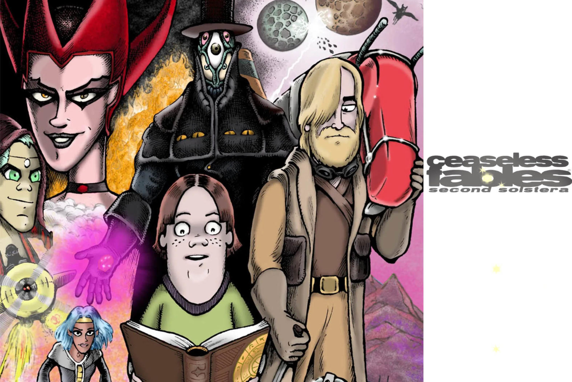
So I went another direction; I threw the readers directly into the Beyonding. Larson, the new human lead (and reader avatar), would be defined in medias res, instead of revealing his backstory at the intro. Even those familiar with the previous 360-page metasaga would find themselves as confused and unsure as Larson finds himself. We see the Nearest Point, where Cornelius found himself transported in page #7… but now there’s something mysterious blocking the passage to Inway. My intent is to make you think I’m making it all up as I go, when in fact I’m planning it as meticulously as ever. Framework for this new saga was laid as far back as 2009.
The first four pages of the Second Solstera were intended to be released daily following the premiere on 2.20.2020; that’s why it seems like Larson has been wandering around in the darkness for weeks. I didn’t have the time to crank the pages out after the 20th. The thing is, those of you who know the strip (the ones who aren’t aggravated with me for focusing on this instead of Bands I Useta Like) should be picking up clues and common elements from the original 360, particularly the time when Cornelius experienced a concussion while on trial at Inway (#46). The date of the premiere was also unmissably significant, if you recall Cornelius’s brief tutelage under Prince Karbunkel of Fargon. Two timelines. Two, twenty, two twenties.
Anyway, back to my original point.
To create a Ceaseless Fables page, I start with a rough dialogue outline, on cheap lined notebook paper. This time I’m using a composition book, because it’s easier to keep the pages from getting everywhere, and I love the sensation of a #2 (there’s that number again) pencil on notebook paper. Just dialogue, and minor “staging” notes, to start with.
Next, after letting that page simmer for a day or two, I go back and check it against my previous notes and published pages, to avoid repeating dialogue, or making different characters seem too alike. Throughout the process, I do this so as to ensure the final product will not seem visually “stale” or repetitive.
Next is the rough sketch outline of the page. In the past I formed the panel outlines into the page’s number, but as I said, I didn’t want to repeat myself, plus I began to feel confined by the paradigm I myself created. So for the Second Solstera pages, the page number is hidden in the images of the page; squint, and you’ll see it. So as per tradition, in a Moleskine book, I breakdown the panel layout, the characters, and their dialogue, to make sure it all fits properly. I typically prefer to let this stage simmer for a week after completion. This helps, because readers will be seeing these pages a week apart. I try to be at least a page ahead, preferably three or more.
Next comes taking a piece of smooth-surface Bristol board and blue-lining the panel layout with a non-photo blue Prismacolor. Prismas are softer than typical non-photo blue pencils, and don’t dig trenches into the page surface ( I can’t have that). Once the borders are blue-lined, I do the same with the dialogue. It must be readable, first and foremost, and still provide room for the characters and action, where applicable. I use an Ames lettering guide to place a single line under the dialogue with a mechanical pencil, to make sure that I don’t skew the words when I ink them. Otherwise I don’t really use the Ames guide for lettering here; it’s overkill, because I’m not going for blueprint-level perfection. And the less I use a “crutch” the better.
Next I letter. I used to do this with a .50 Koh-I-Noor rapidograph, but the last of mine quit some time ago, and they’re too expensive to replace, so I use a Micron 05. Lettering is a meditative practice. If you can’t read my handwriting, I have failed as a cartoonist. So I have to sit perfectly still doing this, and control my breathing, and my hands absolutely cannot shake. If you’ve seen my videos, you see how I shake out my hands every so often. For the rest of the process, I must have hands that do not shake.
Once the lettering is completed, then I ink the speech balloon borders with a Micron 08. Because the characters are blue-lined in place, I know where the balloon “tails” need to point. You may have noticed; Ceaseless Fables never uses captions. This is an agreement I made with myself when I began the strip; all dialogue must emanate from a character. As in (proper) Star Wars, you only know where you are if the characters do and say so.
After the speech balloons are inked, then I ink the panel borders. This ensures that the “flow” of the page is dictated by the dialogue. I also do this with the Micron 08, cleaning up the corners with a Micron 02. No one noticed, but I very slowly phased out the outer page border for Second Solstera, to give the page a “cleaner” overall look. The outer border was mostly necessary for forming the “page number”.
Now the stage is set for the illustration. First I pencil in the top half of the page, so I’m not smudging pencil around with the heel of my hand when I ink. I pencil with a #2, and a mechanical pencil for the fine details, like eyes, faces and hands.
I then ink using two different crowquill pens and an inkwell. Sometimes I use the Microns for curvy or small lines, and Sharpie for heavy back areas. once the top half of the page is inked, I repeat this process for the bottom half. I try to allow several hours for the ink to fully dry, before I gently erase my penciling with a kneaded eraser (#2 pencil eraser for hard-to-reach areas).
This done, I scan the page into Photoshop and color. (I can give you a week’s worth of tips on how to do this, but you have to be a Patron.) I keep a file folder of “color keys”, one for each character/object, so that I don’t have to guess or refer to a previous strip to pick out the proper colors. Once the root colors are laid, I go back in and add the shading and highlights. Generally I do the backgrounds first, on their own layer.
Once the page is finished, I upload the compressed version onto the CFB website. This should give you a general feeling for how much work goes into every page. I employ a truncated version of this method for creating Bands I Useta Like strips, so that I can create them in a fraction of the time. (Ideally; it seldom works out that way, and I have to at least have an idea for a band tucked away for next time.)
If you want to make it look easy, this is about how much work you have to do. This is why my posts are often late and I go through periods of very few site updates. Bear in mind I also survive on private commissions and “straight work”, doing cartoons for a regular newspaper.
This is how I do it. Thanks for listening.